2026 Komori Calendar Created Through the Fusion of NEO HOKUSAI and Print Technology
An Art Director and Artist Discuss the Creative Background
19 March 2026
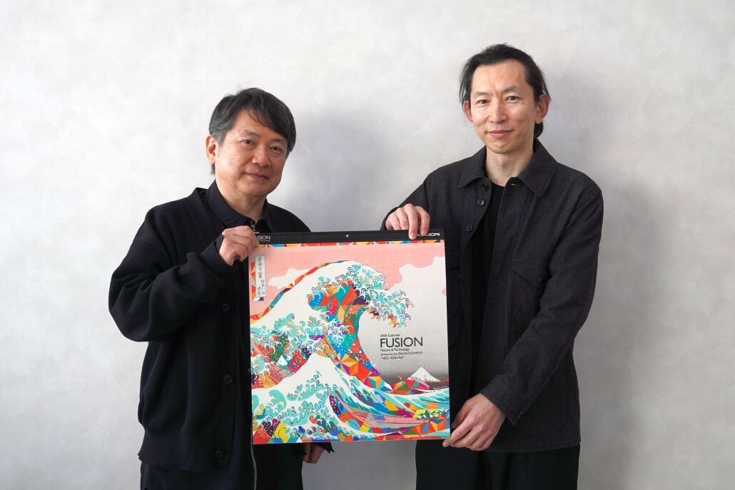
Komori produces a corporate calendar every year as a project symbolizing the Komori Group Purpose: Delivering Kando "beyond expectations" by contributing to society with print technology. Printed entirely on Komori presses, the calendar also serves as a promotional tool that allows viewers to experience Komori's print technology. The 2026 edition adopts the theme "FUSION 'Nature & Technology'" and features the visual concept "NEO HOKUSAI." The calendar project began in 2002 as a collaborative initiative following Komori's delivery of a multicolor printing press to Toppan Printing Co., Ltd (its name at the time).
●The 2026 calendar adopts "NEO HOKUSAI," a concept that fuses the works of Katsushika Hokusai*1 with contemporary design.
●The design emphasizes refined expression and harmony with the original compositions.
●Printing challenges the possibilities of tactile expression to maximize the appeal of the artwork.
●In water scenes, gloss embellishment*2 creates a sense of depth and dimensionality.
●The composition allows viewers to compare the original works with modern elements.
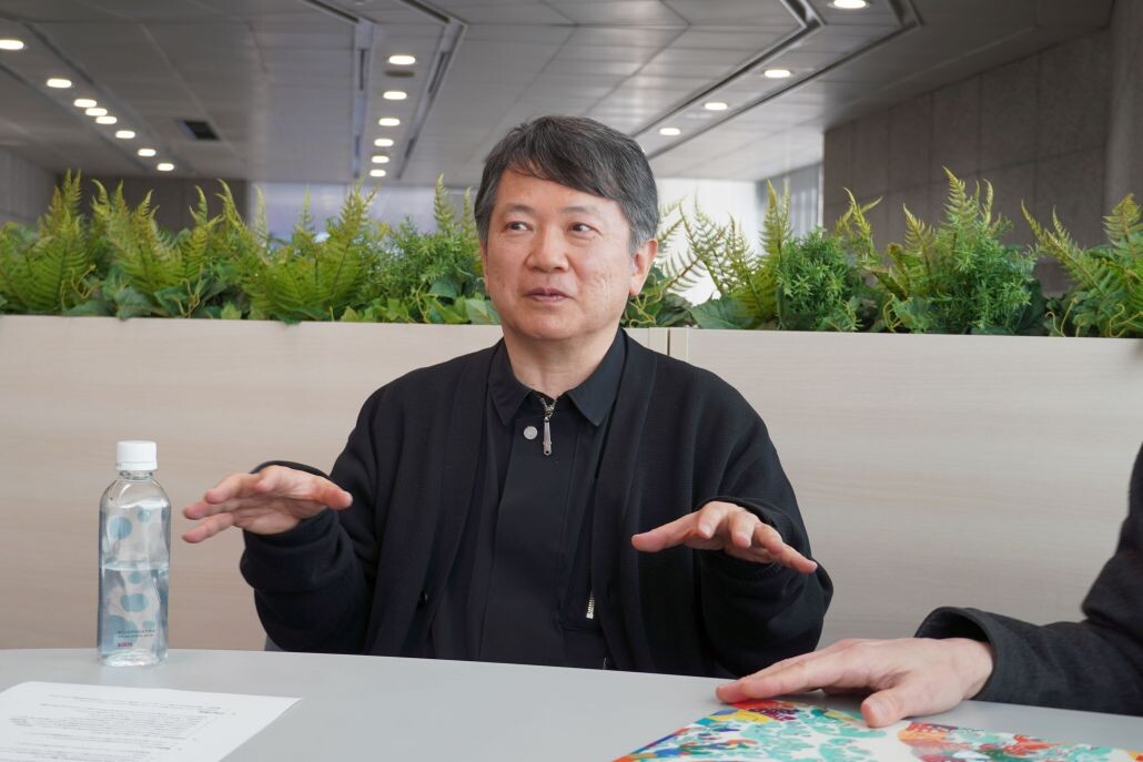
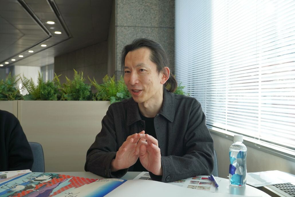
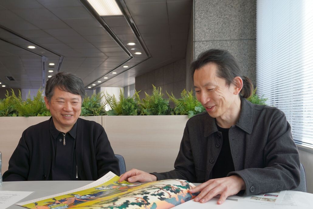
For this edition, we spoke with Hiro Sugiyama of ENLIGHTENMENT, who created the artwork, and Masahiro Aoyagi, Art Director of the Creative Headquarters, Design Center at TOPPAN Graphic Communications Inc., who directed the project from artwork selection through to the completion of the calendar. They shared insights into the background and creative process behind the work.
Interviewee Profiles
Hiro Sugiyama
ENLIGHTENMENT
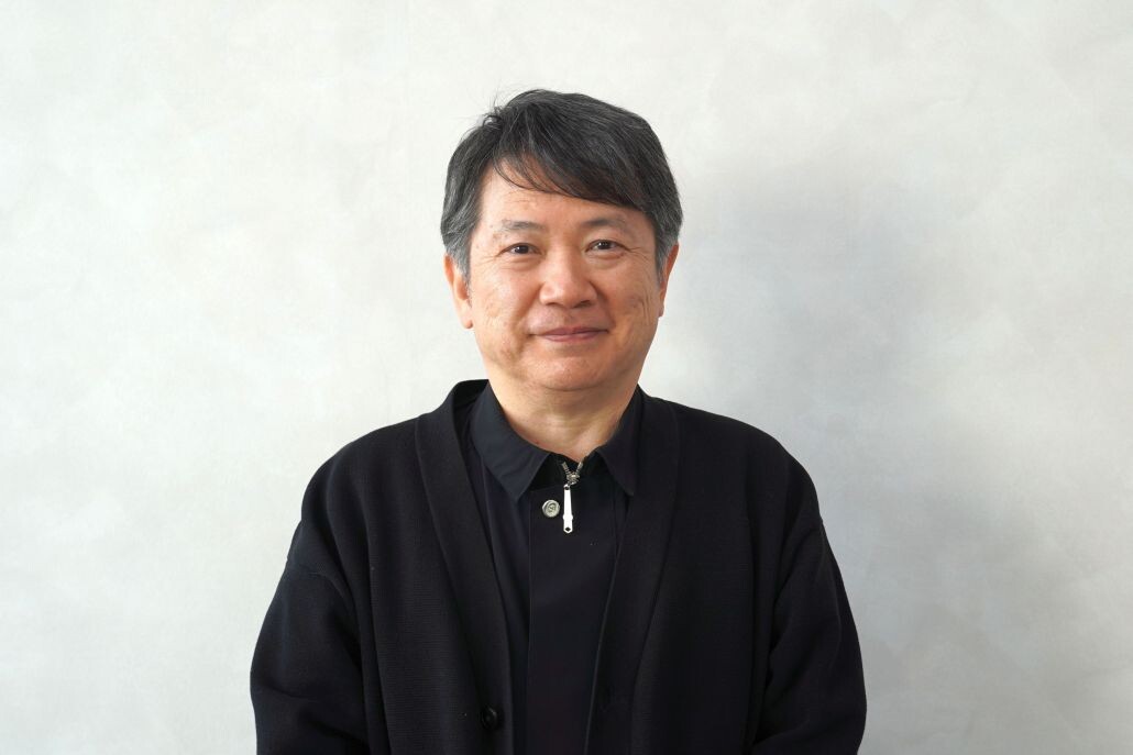
Hiro Sugiyama founded the design studio ENLIGHTENMENT in 1997 and has been active internationally as a contemporary artist working across a wide range of fields, from digital design to fine art. He has produced diverse visual expressions, including collaborations inspired by Katsushika Hokusai and product development with various brands. In this project, he was responsible for creating the NEO HOKUSAI artwork, the central visual concept of the calendar.
Masahiro Aoyagi
Art Director, Creative Headquarters, Design Center
TOPPAN Graphic Communications Co., Ltd.
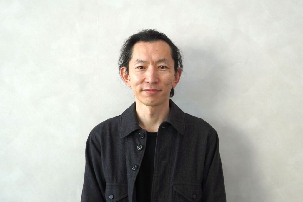
With deep expertise in printing technology and embellishment techniques, Aoyagi has been involved in the calendar project as an art director, overseeing everything from artwork selection and print condition adjustments to the overall quality of the finished product. In this project, he collaborated closely with the artist to pursue the highest level of completion as a calendar.
Background and Creative Approach
The origins of NEO HOKUSAI date back seven or eight years, when Sugiyama was consulted for product development on another project.
"It started as an attempt to create a contemporary look by mixing geometric patterns with the works of Katsushika Hokusai. The concept was to introduce modern fluorescent colors into traditional Japanese ukiyo-e and create a psychedelic atmosphere," Sugiyama recalls.
Regarding the core philosophy behind his design work, he explains: "The value I always prioritize is refinement. Even when using bold colors, I aim to ensure the design has meaning. The compositions in Thirty-six Views of Mount Fuji are extremely well crafted, so rather than altering them, I focused on how much contemporary elements should be introduced and in what balance.
For this calendar, I unified the seasonal flow and color tone across the entire series while ensuring that each page naturally resonates with viewers. The geometric patterns themselves do not carry specific meanings; instead, harmony with the artwork was the priority. We tested dozens of patterns before selecting the most suitable one and further refined the density and combinations of colors.
Since the aspect ratio of the original artwork differs from the calendar format, deciding where to crop the image was a major challenge. The impression of the work changes significantly depending on the cropping position, so finding the right balance without compromising the original impact required careful consideration."
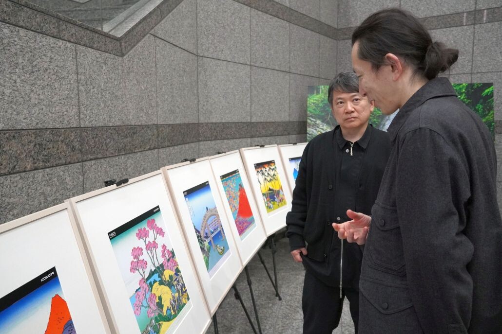
The Komori calendar changes artwork every two months and consists of seven designs including the cover.
Aoyagi explains the selection process:
"When selecting artists, we value originality. We look for artists whose work has not appeared in any corporate calendars before, and in the case of overseas artists, we also consider whether they have not yet been introduced in Japan. Our aim is to select works that will be presented to the public for the first time in a calendar format."
After selecting the artwork, another essential step is determining how to apply Komori's print technology through embellishment techniques.
"The most challenging stage is deciding how to incorporate embellishments. At the same time, we must consider how the work will appear within the calendar format. In this case, NEO HOKUSAI worked particularly well with embellishment techniques, resulting in a very compelling combination."
The Appeal of the Calendar and Future Possibilities
One of the greatest values of print technology is its ability to create tactile expressions that cannot be reproduced with digital data.
"Digital data allows colors and sizes to be easily changed, but it cannot be touched. By printing and giving form to the design, it becomes something people can physically experience. For example, by applying glossy coating to water scenes, the texture of water can be visually and tactilely experienced. The way the appearance changes depending on the angle of light is a value that emerges only when graphics and print are combined," says Aoyagi.
Sugiyama also comments: "I think of NEO HOKUSAI as a modern form of printmaking. I hoped to capture the strength of traditional prints, and the result exceeded my expectations."
Regarding color expression, Aoyagi adds: "To create deeper blues, we mixed fluorescent pink with blue ink to produce subtle tonal differences from standard blue. Within the limited number of spot colors*3 available, we aimed to achieve the richest possible expression."
A Message from Hiro Sugiyama
"I hope people will enjoy discovering a new and unique side of Katsushika Hokusai as they turn the pages of the calendar. By comparing the images with the original works, I believe viewers can also rediscover the greatness of Katsushika Hokusai as one of Japan's most iconic artists.
Some embellishments are intentionally easy to notice, while others are deliberately subtle. I hope viewers enjoy not only the overall composition but also the small discoveries--moments when they realize, 'There was an embellishment here too.' I would be delighted if the calendar becomes something people enjoy for a long time."
The Tactile Appeal of Print
The 2026 Komori Calendar was created through the fusion of NEO HOKUSAI, which combines the traditional worldview of Katsushika Hokusai with contemporary design, and print technology.
We hope you will enjoy experiencing the new value created by this fusion throughout the year.
*1 Katsushika Hokusai: A pioneering Japanese ukiyo-e artist. His innovative compositions and dynamic style, particularly The Great Wave off Kanagawa, inspired many Western Impressionists and continue to influence artists around the world today.
*2 Embellishment: Techniques that enhance visual appearance and texture to add value, enabling expressions that appeal to both sight and touch.
*3 Spot color: Colors used in printing in addition to the standard four process colors (cyan, magenta, yellow, and black), enabling richer color expression.